What's Home Decor Colour Trends for 2022?

Duhome Furniture .
Nov 08, 2021
As the end of the year draws near, it's inevitable that all fashionistas and trendies including you will be curious about what's the colour for 2022. Instead of looking outward to celebrities you admire, or creative TikTokers for cues about colour trends 2022, you can totally trust Pantone, the trend forecasting and colour consultancy. This global colour authority has released a sneak peek at trending colours 2022 in the upcoming year in September.
Move Through with Balance, Calm and Comfort
This season's report - the Pantone Fashion Colour Trend Report for Spring and Summer 2022, includes a range of top 10 bold colours expected to make a splash, as well as 5 season-less core classics that endure throughout years. All these offer tons of home decoration inspiration to bring your home to the next level.
"Colours for Spring 2022 bring together our competing desires for comforting familiarity and joyful adventure through a range of soothing and timeless colours, along with joyous hues that celebrate playfulness." Said Leatrice Eiseman, Executive Director of the Pantone colour Institute in a press release. So this is a year about seeking for balance, calm and comfort with free-spirited optimism and joyful adventure.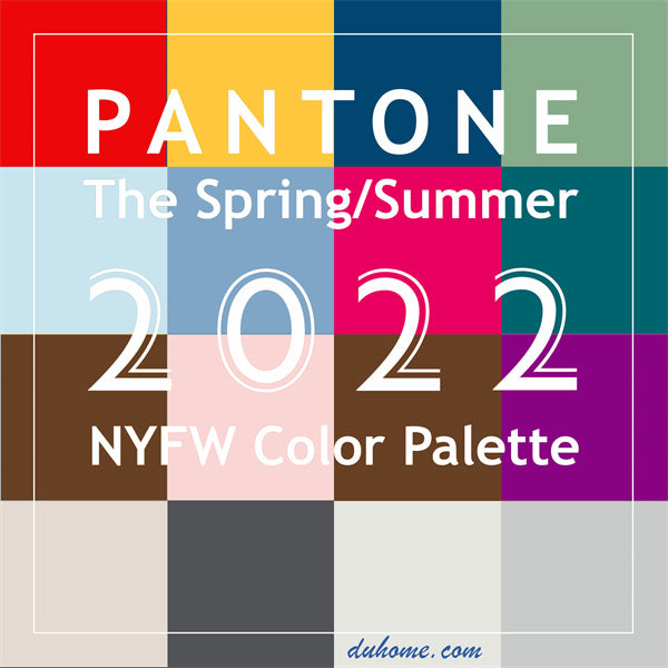
Home Decor Colour Trends 2022
Top primary colours, grounding neutrals and cheerful airy pastels make up Pantone's spring/summer colour trends for 2022. Believe it or not, the colour of your space says a lot about you, especially when you pick it by yourself. Once you want to spruce up your interiors to let your personality shine through, a set of home chairs, benches and ottomans with analogous colour scheme can do wonders. Time to strike the right balance between tranquility and exuberance in your own territory! Let's see how those diverse hues can soothe or invigorate you and your family.
Standout Three Primary Colours
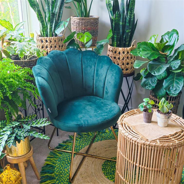
We're always craving for fusing our deep connection to nature. From a tropical flowering tree (PANTONE 18-1564: Poinciana) to a cheery autumn gingko garden (PANTONE 14-0850: Daffodil) and the dark sky before night falls (PANTONE 19-4151: Skydiver), these three primary colours - red, yellow and blue are sure to help welcome nature, tranquility and peace within your home. Trendy colours come and go, but nothing says "statement" more than a vivid red, which brings daring vibrancy and attention to your room. Sunny yellow, the colour of joy and hope, is the best colour to create enthusiasm and bring sunshine for your life. While soothing blue allows you to experience a truly unforgettable retreat near the harbour, where you can hit the beach and enjoy the inner peace. Who doesn't love the colour of nature and desire to bring it inside? Time to amp up your room with these three primary colours.
Stay with the Familiar
While the above-mentioned primary colours inject heaps of vibrant colours with fun hues and joyful descriptors into the new year, people still cannot give up the opportunity to stay with the familiar. I believe you're no exception. Neutrals have been in trend for centuries and it seems that it will continue to do so. The most common neutrals are white (PANTONE 11-0602: Snow White), beige (PANTONE 13-0003: Perfectly Pale), brown (PANTONE 18-1019: Coca Mocha), gray (PANTONE 14-4104: Northern Droplet), and black (PANTONE 18-4004: Poppy Seed), which never go out of style. Year in, year out, those neutrals always stay versatile and timeless with healing and rejuvenation in mind. You'll love the tasty Coca Mocha that warms the spirit and beckons a laid-back afternoon when you're breathing in the steam of fragrant coffee. Trust me, neutral colours are far from boring. Apply them to your home to add a clean yet breezy look and see the potential.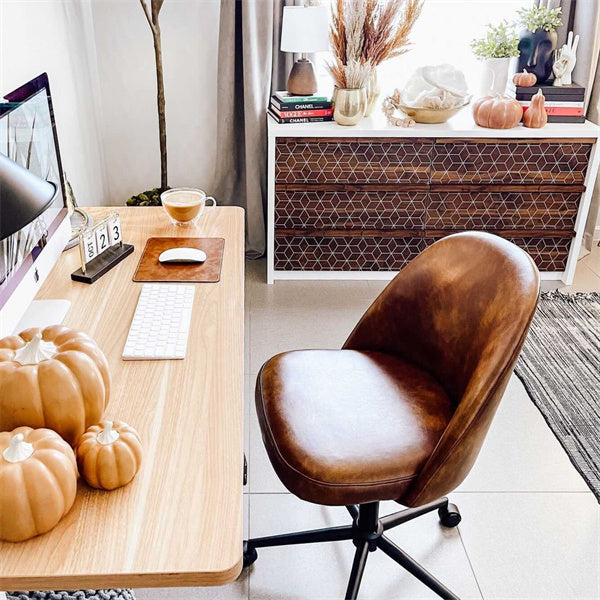
Colours for New Liberation
Besides the three primary colours that you've simply wanted to have in your home, and neutrals to create a steady, quiet, and soothing vibe, colour trend prediction for 2022 also includes some playful yet attractive pastel colours like pink (PANTONE 13-1513: Gossamer Pink), green (PANTONE 18-4728: Harbor Blue) and purple (PANTONE 18-3324: Dahlia) etc. Free-spirited optimism and a feeling of new liberation are well unleashed when those shades collide and mix perfectly. Soft, youthful and sweet pink brings the romance of sakura, while serene shades of blue and green mimic the colour of vintage emerald, drawing inspiration from the nature gemstone.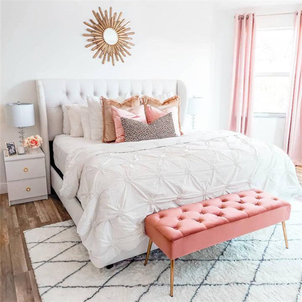
2022 Colour Trends
All these different colours - visually arresting primary colours, 5 earthy yet versatile neutrals and lighthearted pastels come together to inspire your playful creativity, evoke your aspiration for comfort and security, as well as quench your fervent desire for uplift and happiness. Apply them to reinvigorate your living spaces with balanced nature beauty and unconstrained visual expression. And if you're wondering what the 'It' colour for 2022 will be, please stay tuned! You may find it later at Duhome Accent Chair Collection.
Move Through with Balance, Calm and Comfort
This season's report - the Pantone Fashion Colour Trend Report for Spring and Summer 2022, includes a range of top 10 bold colours expected to make a splash, as well as 5 season-less core classics that endure throughout years. All these offer tons of home decoration inspiration to bring your home to the next level.
"Colours for Spring 2022 bring together our competing desires for comforting familiarity and joyful adventure through a range of soothing and timeless colours, along with joyous hues that celebrate playfulness." Said Leatrice Eiseman, Executive Director of the Pantone colour Institute in a press release. So this is a year about seeking for balance, calm and comfort with free-spirited optimism and joyful adventure.

Home Decor Colour Trends 2022
Top primary colours, grounding neutrals and cheerful airy pastels make up Pantone's spring/summer colour trends for 2022. Believe it or not, the colour of your space says a lot about you, especially when you pick it by yourself. Once you want to spruce up your interiors to let your personality shine through, a set of home chairs, benches and ottomans with analogous colour scheme can do wonders. Time to strike the right balance between tranquility and exuberance in your own territory! Let's see how those diverse hues can soothe or invigorate you and your family.
Standout Three Primary Colours
We're always craving for fusing our deep connection to nature. From a tropical flowering tree (PANTONE 18-1564: Poinciana) to a cheery autumn gingko garden (PANTONE 14-0850: Daffodil) and the dark sky before night falls (PANTONE 19-4151: Skydiver), these three primary colours - red, yellow and blue are sure to help welcome nature, tranquility and peace within your home. Trendy colours come and go, but nothing says "statement" more than a vivid red, which brings daring vibrancy and attention to your room. Sunny yellow, the colour of joy and hope, is the best colour to create enthusiasm and bring sunshine for your life. While soothing blue allows you to experience a truly unforgettable retreat near the harbour, where you can hit the beach and enjoy the inner peace. Who doesn't love the colour of nature and desire to bring it inside? Time to amp up your room with these three primary colours.

Stay with the Familiar
While the above-mentioned primary colours inject heaps of vibrant colours with fun hues and joyful descriptors into the new year, people still cannot give up the opportunity to stay with the familiar. I believe you're no exception. Neutrals have been in trend for centuries and it seems that it will continue to do so. The most common neutrals are white (PANTONE 11-0602: Snow White), beige (PANTONE 13-0003: Perfectly Pale), brown (PANTONE 18-1019: Coca Mocha), gray (PANTONE 14-4104: Northern Droplet), and black (PANTONE 18-4004: Poppy Seed), which never go out of style. Year in, year out, those neutrals always stay versatile and timeless with healing and rejuvenation in mind. You'll love the tasty Coca Mocha that warms the spirit and beckons a laid-back afternoon when you're breathing in the steam of fragrant coffee. Trust me, neutral colours are far from boring. Apply them to your home to add a clean yet breezy look and see the potential.

Duhome Harrisburg Swivel Chair
Colours for New Liberation
Besides the three primary colours that you've simply wanted to have in your home, and neutrals to create a steady, quiet, and soothing vibe, colour trend prediction for 2022 also includes some playful yet attractive pastel colours like pink (PANTONE 13-1513: Gossamer Pink), green (PANTONE 18-4728: Harbor Blue) and purple (PANTONE 18-3324: Dahlia) etc. Free-spirited optimism and a feeling of new liberation are well unleashed when those shades collide and mix perfectly. Soft, youthful and sweet pink brings the romance of sakura, while serene shades of blue and green mimic the colour of vintage emerald, drawing inspiration from the nature gemstone.

Duhome Anaheim Bedroom Bench
2022 Colour Trends
All these different colours - visually arresting primary colours, 5 earthy yet versatile neutrals and lighthearted pastels come together to inspire your playful creativity, evoke your aspiration for comfort and security, as well as quench your fervent desire for uplift and happiness. Apply them to reinvigorate your living spaces with balanced nature beauty and unconstrained visual expression. And if you're wondering what the 'It' colour for 2022 will be, please stay tuned! You may find it later at Duhome Accent Chair Collection.
